The DU Lounge
Related: Culture Forums, Support ForumsBook Cover Art v1.5 and 2
I'd like to thank everyone for your advice on my last thread. In case you missed it, I'm drawing cover art for a science fantasy book I wrote. The first image you'll see (A) is the one from my last thread but with several tweaks to up the contrast and make the character match the background more. The second is an alternative setting I might use instead. Which do you prefer?
A
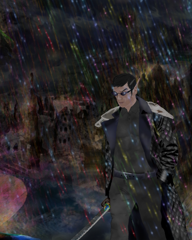 /v1/fill/w_800,h_1000,al_c,q_85,enc_auto/Refract%20Cover%20Test%20v2.jpg
or B?
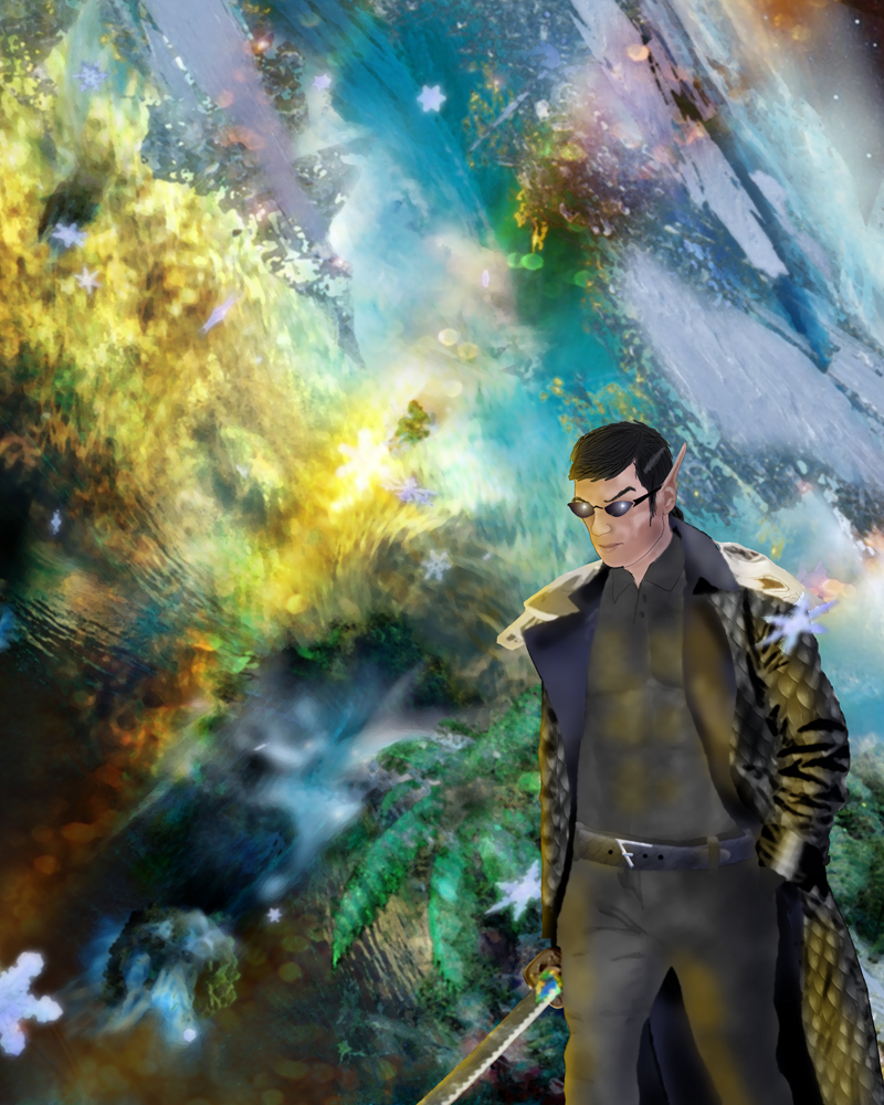 /v1/fill/w_800,h_1000,al_c,q_85,enc_auto/Refract%20Cover%20Test%20v2%20Brak%20Thaa.jpg
 = new reply since forum marked as read
Highlight:
NoneDon't highlight anything
5 newestHighlight 5 most recent replies
= new reply since forum marked as read
Highlight:
NoneDon't highlight anything
5 newestHighlight 5 most recent replies

SheltieLover
(62,732 posts)But if in your story he is walking among those who are more normal without being noticed, then maybe the bottom one.
Not sure I'm conveying what I'm feeling...
BTW, congrats on finishing your book!


Think. Again.
(21,382 posts)...or what event could cause such fallout.
The second piece doesn't tell me anything about the environment, but doesn't raise any questions about it either.
Ocelot II
(123,066 posts)The second one is too cluttered.


Donkees
(32,673 posts)to the character's face and body. I'm not fond of the snowflakes especially the perfectly centered one near the top. They remind me more of the 'snowflake projectors' used at christmas, than nuclear winter. Keep focusing on where you are leading the viewer's eye around the page, and where it stops. Keep refining.

electric_blue68
(20,097 posts)
surrealAmerican
(11,561 posts)Will they be looking at it as a small "thumbnail"? ... or from a distance? ... as a physical object in a poorly lit space?
The answers to these questions matter more than how they look at full size on our screens.

Rizen
(831 posts)It looks like people generally prefer A, which was surprising. I'm glad as that location plays a very important role in my story.